Unpacking The Bitcoin Market
Diving deeper into active coins, and bitcoin cohorts.

Bitcoin has been grinding between $65,000 and $70,000 for about two weeks now, currently sitting around $68,000. This kind of sideways price action might feel frustrating, but if you've been following the on-chain data, it shouldn't come as a surprise. This is textbook bear market behavior, and the metrics are painting a clear picture of where we are in the cycle.
Key On-Chain Levels at a Glance
Here's the current snapshot from the ChartInspect dashboard:
| Metric | Level | Status |
|---|---|---|
| Short-Term Holder Cost Basis | ~$89,300 | STHs deep underwater |
| True Market Mean | ~$78,700 | Below this level, historically a DCA zone |
| Bitcoin Price | ~$68,300 | Hovering in mid-range |
| AVIV -1σ Band | ~$59,400 | Held as support at the $60K bounce |
| Realized Price | ~$54,750 | Potential downside target |
| Long-Term Holder Cost Basis | ~$41,200 | Deep support, structural floor |
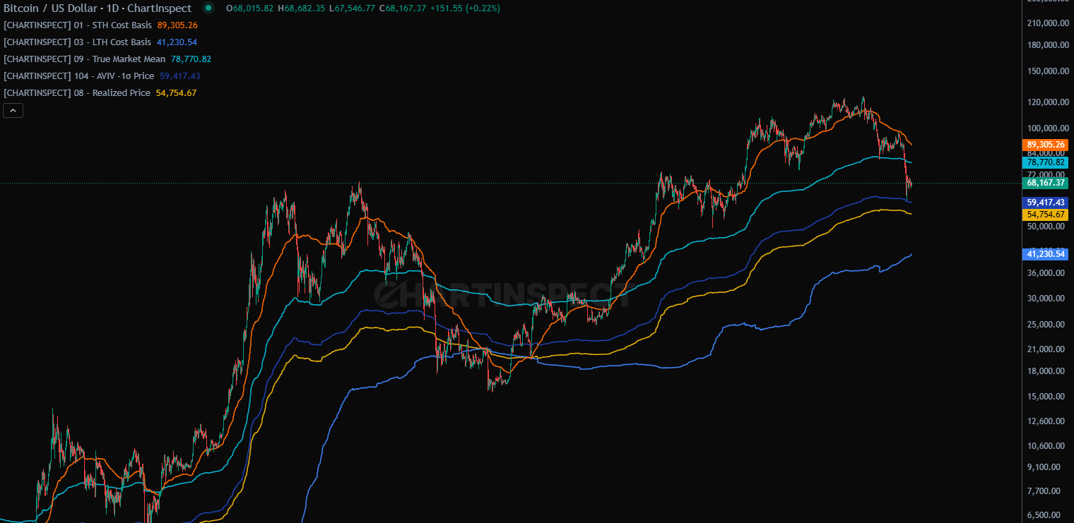
We're trading well below the True Market Mean and the STH cost basis, which puts us firmly in historically undervalued territory.
Supply Distribution: The Hands Are Shifting
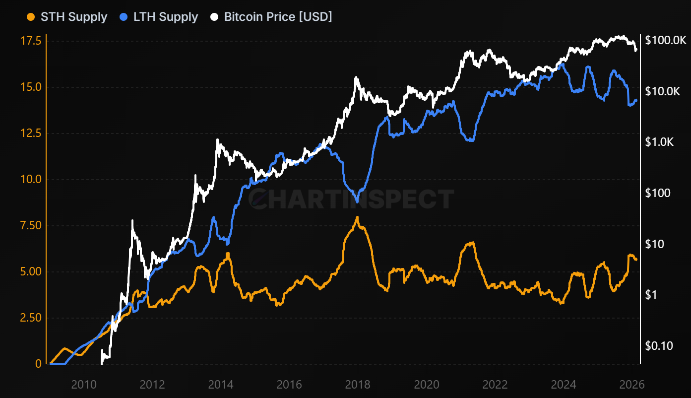
Track Bitcoin supply distribution between Short-Term Holders vs Long-Term Holders (STH vs LTH Supply) - short-term holders
on-chain-metrics / sth-lth
(<155 days), long-term holders (≥155 days), and exchange holdings to identify market cycle phases and accumulation patterns
chartinspect.com
Before we dive into ratios and valuations, let's start with the raw supply picture. As of today, Long-Term Holders control 14.37 million BTC (71.9%) of the circulating supply, while Short-Term Holders hold just 5.62 million BTC (28.1%).
This kind of LTH dominance is characteristic of bear markets. What's happening under the surface is a transfer of coins from weak hands to strong hands. Short-term participants who bought at higher prices are either capitulating at a loss or simply aging into long-term holder status as time passes. Either way, supply is concentrating in the hands of patient accumulators, and that process is far from over.
Historically, this supply imbalance continues to widen throughout bear markets until short-term holder supply reaches a cyclical low. That's typically when the market has fully reset and is ready for the next expansion. We're moving in that direction, but we're not there yet.
STH/LTH Realized Price Ratio
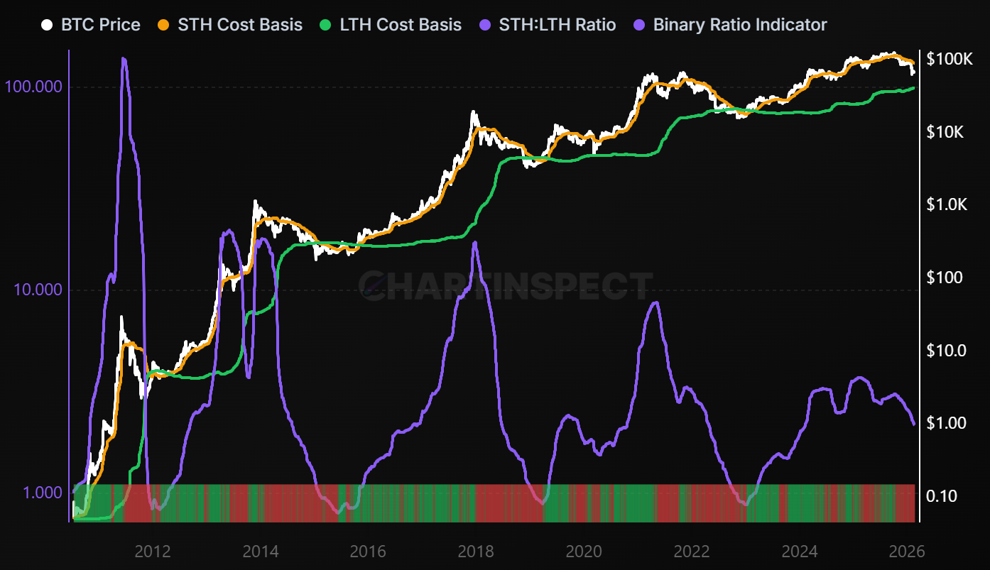
Compares the average acquisition price of Short-Term Holders to Long-Term Holders, revealing cohort positioning and market dynamics.
on-chain-metrics / sth-lth-realized-price-ratio
When STH cost basis exceeds LTH cost basis, it indicates recent buyers paid premium prices, often signaling potential distribution phases.
chartinspect.com
Zooming into the cost basis side of this dynamic, the STH/LTH Realized Price Ratio currently sits at 2.166. This means short-term holders paid more than double what long-term holders did on average. That kind of spread has historically lined up with distribution phases that precede extended drawdowns or bottoming processes.
As short-term holders capitulate or age into long-term holders, this ratio compresses. That compression is one of the hallmarks of a maturing bear market, and we're right in the middle of it.
LTH Wealth Concentration: Following the Smart Money
Measure the percentage of total realized capital held by Long-Term Holders (LTH). This metric tracks wealth distribution and
on-chain-metrics / lth-wealth-concentration
holder conviction, with high values (>75%) indicating strong holder accumulation and low values (<50%) suggesting distribution phases
chartinspect.com
This is one of my favorite structural metrics and it ties directly into the supply dynamics we just covered. LTH Wealth Concentration measures the percentage of total realized capital held by Long-Term Holders, essentially, how much of Bitcoin's aggregate cost basis belongs to the 155+ day cohort. It's calculated as LTH Cost Basis divided by the total Realized Cap.
Current reading: 54.12%, with concentration actively increasing (+0.207%).
Here's how to interpret this metric:
- Above 75%: Strong accumulation complete, selling pressure exhausted. This is where prior cycle bottoms have formed.
- 50–75%: Balanced distribution. The transfer from short-term to long-term holders is underway but not yet mature.
- Below 50%: Distribution phase. Short-term holders are dominant, volatility is elevated, and the market is typically in or approaching a top.
We just crossed back above 50%, which confirms we've transitioned out of the distribution phase and into the accumulation regime. But at 54%, we're still in the early innings. For reference, prior cycle bottoms saw this metric climb above 70% before the market truly turned, in 2015, 2018-2019, and late 2022, that 70%+ zone is where the final capitulation was absorbed by long-term conviction holders.
That said, it doesn't have to reach 70%+ for a bottom to form. During the 2020 pandemic crash, the metric was only around 60-65% when Bitcoin bottomed near $3,800. That was a macro-driven event rather than a typical cycle bottom, but it shows that external catalysts can accelerate the process.
The key takeaway is directional: LTH Wealth Concentration is rising, which means long-term holders are absorbing supply and the market's cost basis is shifting toward patient capital. That's exactly what you want to see in a bear market, but we likely need significantly more concentration before this cycle's bottom is fully in.
AVIV NUPL: Fair to Undervalued
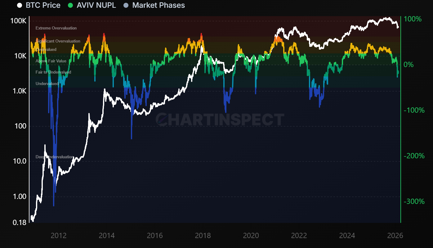
Track the True Market Mean variant of Net Unrealized Profit/Loss (AVIV-NUPL).
on-chain-metrics / aviv-nupl
Measures unrealized profit/loss adjusted for network activity using the Cointime Economics framework. Extreme values often coincide with market extremes.
chartinspect.com
The AVIV NUPL measures unrealized profit and loss adjusted for network activity using the Cointime Economics framework. It's currently reading -15.6%, which places Bitcoin squarely in the "Fair to Undervalued" zone.
This metric strips out the noise of dormant supply and focuses on what active participants are actually experiencing. A negative reading means that on aggregate, the coins moving on-chain are sitting at a loss. We haven't reached the "Deep Undervaluation" territory that marked prior cycle bottoms yet, but we're heading in that direction.
In 2022, AVIV NUPL spent months in similar territory before Bitcoin ultimately bottomed near $15,500. In 2018, the same pattern played out over a longer timeframe. The takeaway: we're in a zone where long-term accumulation has historically been rewarded, but we may not have seen the final capitulation yet.
New Metric Spotlight: Active MVRV (Normalized)
One of the newest additions to ChartInspect's PRO suite is the Active MVRV Norm, and it's worth understanding why this metric matters.
The Problem with Traditional MVRV
The standard MVRV ratio compares Bitcoin's market cap to its realized cap. It's simple and powerful, but it has a flaw: it includes all coins in its calculation, even the ones that haven't moved in 5, 10, or even 14 years. These dormant coins drag down the realized cap over time, creating a structural decay in the metric's peaks. We saw highs of 7-8x in 2011, around 5x in 2013 and 2017, roughly 4x in 2021, and this cycle barely registered overheated levels at all.
The Active MVRV Solution
The Active MVRV fixes this by isolating only the coins that are actually moving on-chain. It weights the traditional MVRV by network liveliness, a concept rooted in the Cointime Economics framework developed by Glassnode and ARK Invest. This filters out long-dormant supply and gives us a much clearer read on what current market participants are actually doing.
Why Normalize?
Even the Active MVRV grows with each cycle as Bitcoin matures. To make cross-cycle comparisons possible, I normalize the metric over a rolling window and compress it into a 0 to 100% range:
- Above 75% → Historically lines up with cycle tops. The 2021 peak hit around 77%, and this cycle topped near 78%.
- 20–40% → Neutral-to-cool territory. Drawdown is underway, but not yet at deep value.
- Below 10% → Deep accumulation zone. Every prior cycle bottom has occurred in this range.
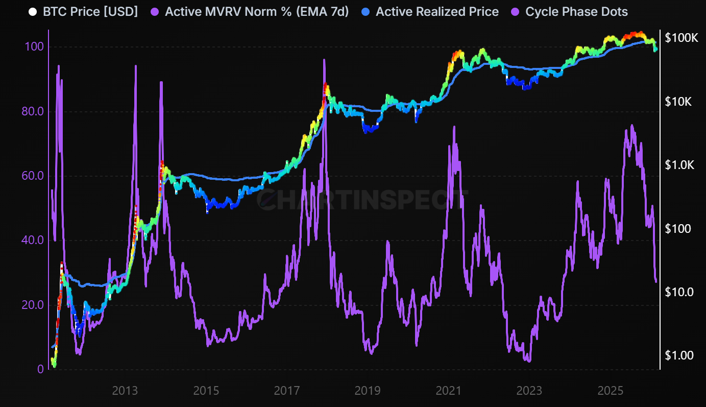
Active MVRV adjusted for network activity using Cointime Economics principles, then normalized over a multi-cycle rolling window to produce a consistent 0-100% cycle indicator.
on-chain-metrics / active-mvrv-norm
High readings (above 70%) indicate active supply is extremely overvalued relative to recent history, historically aligning with cycle tops. Low readings (below 8%) indicate active supply is near or below cost basis, historically aligning with cycle bottoms.
chartinspect.com
Current reading: ~27%. We're on the lower end of neutral, similar to where Bitcoin was in mid-2022 before the final leg down to $15K. In 2018 and 2014, comparable readings came before one more significant move lower before the cycle truly bottomed.
The color-coded price overlay tells the story visually. We've moved from the overheated reds and yellows of the cycle peak into the cooler blues and greens of a drawdown phase, but we haven't hit the deep blue of maximum opportunity yet.
My Bottom Range: $50,000 to $60,000
Based on everything the on-chain data is showing, I'm standing by the $50,000 to $60,000 range as the likely bottom zone for this cycle. We already tested $60,000 about three weeks ago and bounced off the AVIV -1σ band. A retest of those levels, and potentially a wick toward the realized price near $55,000, is still a realistic scenario.
That said, I want to be upfront about something: Bitcoin is maturing as an asset class. With ETFs, institutional allocators, and increasingly sophisticated market participants in the mix, the structural dynamics are changing. The 80%+ drawdowns we saw in prior cycles may not be the template going forward. For this cycle, the data still supports $50-60K as an area of extreme value. But I'm becoming more cautious about leaning too heavily on historical precedent for future cycles.
The Bigger Picture: Boring Is Where Fortunes Are Built
If you're reading this and feeling unenthusiastic about the market, good. That's exactly how accumulation phases are supposed to feel. The people who dollar-cost averaged through the sideways grind of 2015, 2018-2019, and 2022 were the ones who captured the most upside when the next bull market came.
Below the True Market Mean at $78,800, history suggests this is where long-term investors should be paying attention. We could have another 8 to 10 months of bear market conditions ahead. It will not be exciting. But this is historically where the real opportunities are built. Quietly, patiently, one block at a time.
Track It All on ChartInspect
All of the metrics discussed in this newsletter are available at ChartInspect.com:
- Free users get daily updates on all core metrics
- PRO users get block-time updates (roughly every 10 minutes), custom Telegram/email alerts, the full PRO chart suite including Active MVRV Norm, and access to our private Telegram group for daily on-chain discussion
I've been adding a lot of new charts and features for PRO users over the past few weeks, and I'm always looking for feedback. Drop a comment or message me in the Telegram group if there's something you'd like to see.
Not financial advice. Always do your own research.
Thanks for reading. See you in the next one.
Enjoyed this article?
Subscribe to get the latest research in your inbox.
Comments
Sign in to join the discussion.